Design & Experience decides how a brand feels in digital form. Whether people quickly understand what they are meant to do. Whether a product feels light or complicated. Whether trust builds or friction does.
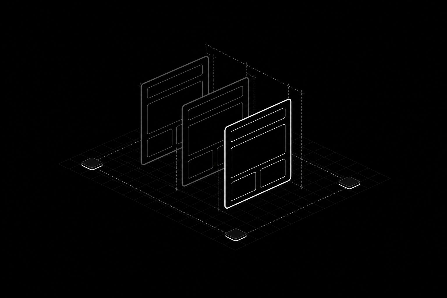
We connect UI/UX design, webdesign, app design and design systems into one coherent design logic. Instead of isolated screens or loose mockups, the result is a system that creates orientation, organises content better and makes interface decisions understandable.
Structure before surface
Most website problems are not design problems but structure problems. Too many equally weighted entry points. Navigation named after internal org charts instead of what visitors are looking for. Pages trying to serve three audiences at once and convincing none of them.
So we start with information architecture: who arrives with which question, at which stage of the decision, through which channel? That determines which pages are needed, what the single most important action on each is, and what can be removed entirely.
Only then do we talk about layout. A well-structured draft tolerates many visual directions. A badly structured one does not get better by looking good.
User guidance that creates momentum
Good interface design is largely about removing decisions. One clear entry point instead of five equally weighted buttons. Forms that only ask for what the next step requires. States that stay understandable — including when something fails, loads, or is empty.
We design those states as part of the work, not afterwards. The empty state of a list, the error message on a form and the loading behaviour of a page are part of the experience, and often the moments where trust is won or lost.
Accessibility belongs in the foundation rather than the final round: sufficient contrast, visible focus states, usable tap targets, motion that can be switched off. That is simply good design — and under the European Accessibility Act it is now a legal requirement for many providers.
Mobile is the default case
Most traffic arrives from a phone, often on the move, often on a weak connection, often one-handed. That is not a reduced version of the desktop; it is the actual design case.
We design accordingly: content in the order that makes sense on a narrow screen. Controls within thumb reach. Images at sizes that load on mobile networks. Typography readable without zooming.
Design systems: so it does not fall apart after launch
A relaunch looks good on release day. What happens afterwards decides its value. Without a system, every new page brings new spacing, new button variants, new shades of grey — and two years later the site looks like three different sites.
So we build components rather than pages – in Framer just as in Nuxt: defined tokens for colour, type and spacing, reusable building blocks with clear rules, documented states. The result is a system your team can build new pages with, without every page forcing a design decision.
That ties design directly to implementation: what is a building block in the design is a component in the code. Handoffs get shorter, deviations rarer.
When website, product and app belong together
This matters most when there is not only a website but also a product, a customer area or an app. Those surfaces usually appear at different times, with different people involved — and then feel like offerings from different companies.
We carry one design logic across every touchpoint: same language, same patterns, same recognition. Not identical layouts, but a recognisable hand.
Typical work in this area:
- UI/UX design for complex digital products
- Webdesign for brands, launches and conversion paths
- App design for mobile and digital touchpoints
- Design systems for scalable teams and consistent interfaces

